Workflow Overview
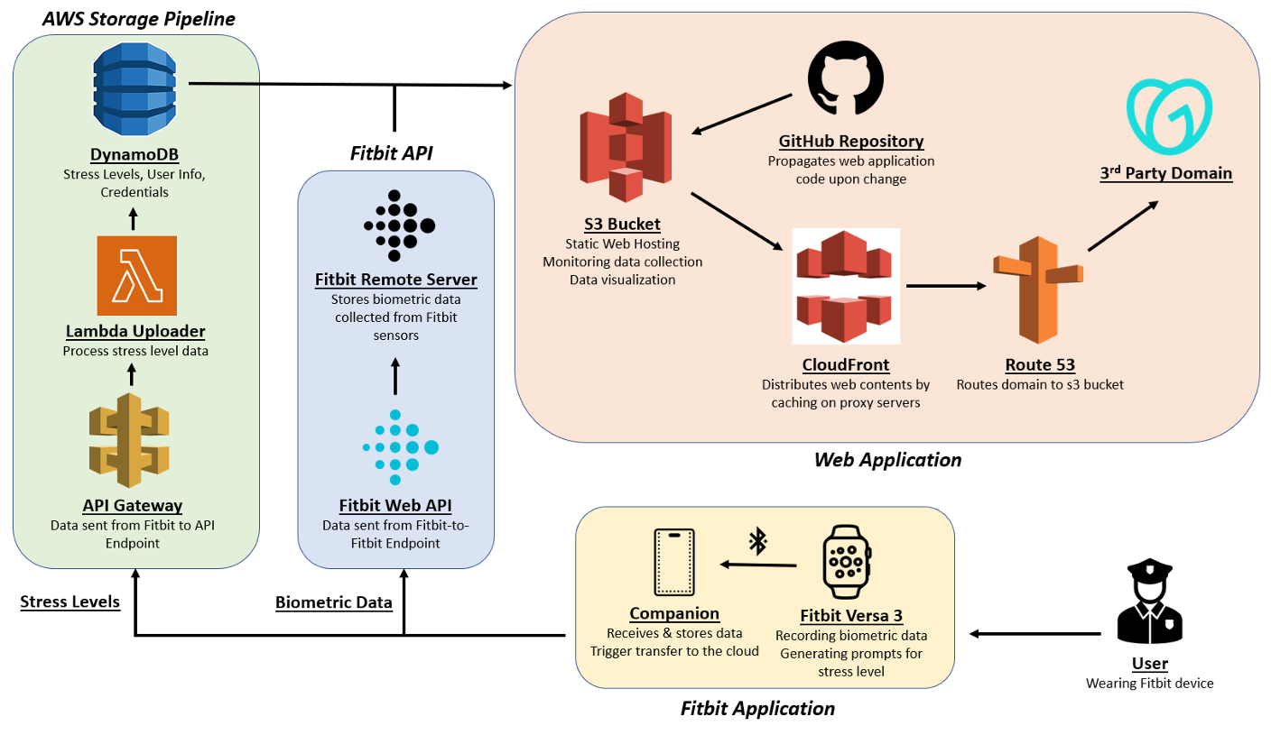
This workflow diagram illustrates the integration of Fitbit devices, AWS infrastructure, and a web application to collect, process, and display biometric data and stress levels. It begins with the user wearing a Fitbit Versa 3 device that records biometric data (e.g., heart rate) and generates stress prompts. The companion app on a smartphone transfers this data via the Fitbit Web API to the Fitbit Remote Server, which stores the data temporarily. The data is then processed and sent through an API Gateway to AWS Lambda functions, which store it in a DynamoDB database for analysis. On the web application side, static content and visualizations are hosted in an S3 bucket and distributed globally via CloudFront, with Route 53 handling domain routing. This setup ensures seamless data collection, processing, and visualization for users and researchers.
Fitbit
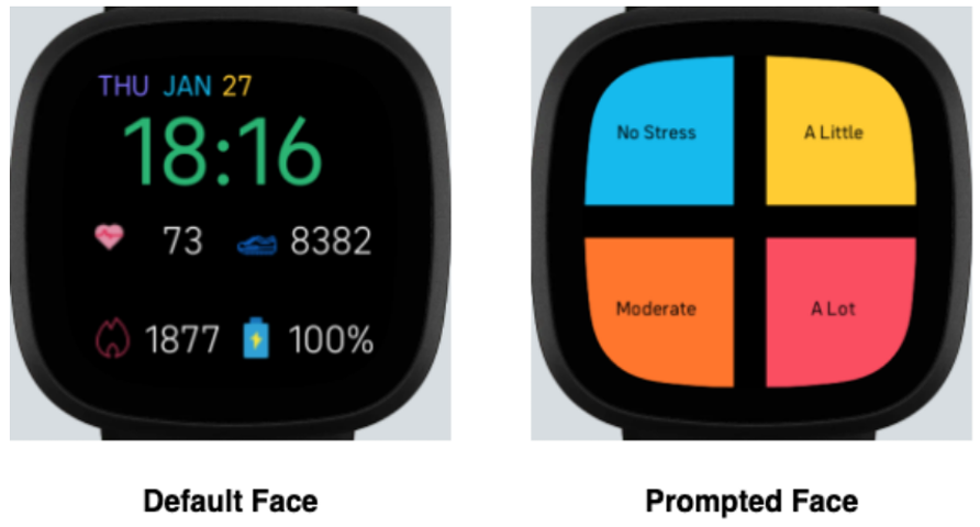
This is Fitbit. This image showcases the two interfaces of the Fitbit application used for stress monitoring. The Default Face displays key biometric metrics, such as the user's heart rate, steps taken, calories burned, and battery life, offering an overview of daily activity and health. The Prompted Face appears when the application detects a significant rise in the user's heart rate, potentially indicating stress. It presents the user with four stress level options: "No Stress," "A Little," "Moderate," and "A Lot," allowing them to self-report their stress levels in real-time. This system facilitates immediate and intuitive data collection for stress analysis.
Stress Level Distribution by Gender
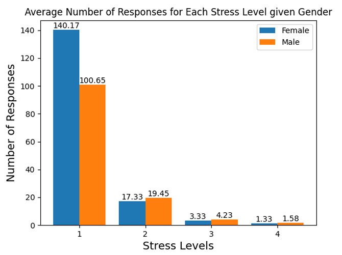
This bar chart shows the average number of responses for each stress level categorized by gender (female in blue and male in orange). Stress levels range from 1 (lowest) to 4 (highest). The data indicates that both males and females most frequently report stress level 1, with females responding significantly more often (140.17 vs. 100.65). As stress levels increase, the number of responses decreases dramatically, with minimal responses recorded at levels 3 and 4. This trend suggests that participants, regardless of gender, rarely perceive themselves in higher stress levels, though females are slightly more likely to report at these levels than males. The chart highlights gender differences in stress perception and reporting tendencies.
.png)
Cohort Engagement and Emotional Metrics
This composite visualization offers an overview of user engagement and emotional metrics across different cohorts in the study. The chart on the left displays the total number of entries, the maximum consecutive days, and the maximum consecutive weeks of survey participation, highlighting how consistently users engaged with the data collection process. The cluster of lines indicates varying levels of consistency among cohorts and individual users. The right section focuses on mood metrics, such as "Angry," "Calm," "Cheerful," "Excited," and others, showing the average scores or trends reported by users. Each line represents an individual user, grouped by cohort, and illustrates fluctuations in emotional states over time. This chart captures the diversity of mood responses, with certain emotions like "Calm" exhibiting more stable trends compared to others like "Nervous" or "Stressed." Overall, this visualization emphasizes the variability in user participation and emotional reporting, providing valuable insights into engagement patterns and emotional dynamics during the study.
.png)
Survey Participation Metrics by Cohort
This visualization consists of two panels that summarize user engagement and mood metrics across cohorts: 1. Top Panel - Average Total Entries and Contiguous Metrics by Cohort: This line graph compares the average number of total entries, maximum contiguous days, and maximum contiguous weeks for survey participation across cohorts. The total entries line shows a significant decline between cohorts, while the maximum contiguous days and weeks remain relatively stable at lower counts. This indicates a drop in overall participation but relatively consistent short-term engagement patterns. 2. Bottom Panel - Average Mean Mood Scores by Cohort: This multi-line chart displays average mood scores for various emotional states (e.g., "Calm," "Nervous," "Excited") across cohorts. Positive emotions such as "Calm" and "Cheerful" generally have higher averages, while negative emotions like "Angry" and "Nervous" remain lower. Some fluctuations in mood scores are evident between cohorts, highlighting the variability in emotional experiences among participants. Together, these panels highlight trends in survey participation and emotional states, offering insights into engagement levels and emotional dynamics across the study cohorts.
.png)
Survey Submissions Over Time
This line chart illustrates the number of surveys submitted over time during the study period. Each point represents the total number of surveys submitted on a specific date. The graph reveals substantial fluctuations in participation, with peaks on certain days where survey submissions exceeded 20, followed by periods of lower activity. The pattern suggests irregular engagement, with some spikes potentially coinciding with specific events or reminders. The overall trend highlights the challenges of consistent data collection in real-world settings, emphasizing the importance of improving participant adherence to maintain steady survey responses.
.png)
Weekly Survey Submissions
This line chart illustrates the number of surveys submitted each week over the course of the study. The graph shows a sharp rise in survey submissions during the first few weeks, peaking around Week 3. After this peak, there is a noticeable decline in participation, with fluctuations observed in later weeks. A small spike is evident around Week 15, but overall survey submissions taper off significantly in the second half of the study, with consistently low levels of engagement from Week 20 onwards. This trend highlights an initial enthusiasm or adherence to survey submissions, followed by declining engagement as the study progressed. This pattern emphasizes the need for strategies to sustain participant motivation and improve long-term data collection consistency.
.png)
Time-of-Day Survey Engagement
This line chart illustrates the number of survey entries submitted over time, segmented by the time of day: Morning (<10 AM, blue), Midday (10 AM–3 PM, green), Late Afternoon (3–7 PM, yellow), and Evening (>7 PM, red). The chart shows that the majority of entries are submitted in the morning and midday, as indicated by the dominant peaks in the blue and green lines. Entries during the late afternoon and evening are sparse, with consistently low counts. Peaks in morning submissions may suggest a preference or habit for participants to complete surveys earlier in the day, while the diminishing engagement later in the day highlights potential barriers, such as fatigue or forgetfulness, affecting participation. This visualization emphasizes the importance of considering time-of-day trends in optimizing survey engagement and planning data collection strategies.
.png)
Time-of-Day Engagement by Week
This line chart illustrates the number of survey entries over time by week, segmented by time of day: Morning (<10 AM, blue), Midday (10 AM–3 PM, green), Late Afternoon (3–7 PM, yellow), and Evening (>7 PM, red). Morning and midday submissions dominate the chart, with the highest peaks occurring in the first few weeks, particularly in Weeks 2 and 3. Over time, the number of entries gradually declines across all time periods, with a slight resurgence in activity around Week 15. Late Afternoon and Evening submissions (yellow and red) remain consistently lower throughout the study. This visualization demonstrates a strong preference for submitting surveys in the morning and midday, as well as declining engagement as the study progresses, emphasizing the need for strategies to sustain participation and balance responses across different times of the day.
Composite User Participation Metrics
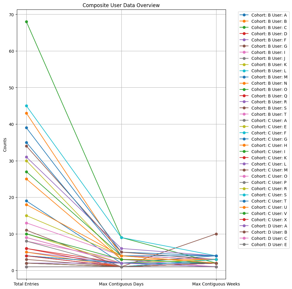
This chart, titled Composite User Data Overview, visualizes user participation metrics across different cohorts. Each line represents a user and shows their Total Entries, Max Contiguous Days, and Max Contiguous Weeks of participation. • Total Entries shows the highest values, reflecting the overall number of surveys submitted by each user. • Max Contiguous Days and Max Contiguous Weeks indicate the duration of consistent participation and exhibit a sharp decline compared to Total Entries, suggesting that users were less consistent over longer periods. The variety in lines highlights significant differences in engagement between users and cohorts, with some users showing high totals but lower consistency, and others maintaining steadier participation for contiguous periods. This visualization underscores the variability in user behavior and the need for strategies to encourage both high participation and consistent engagement.
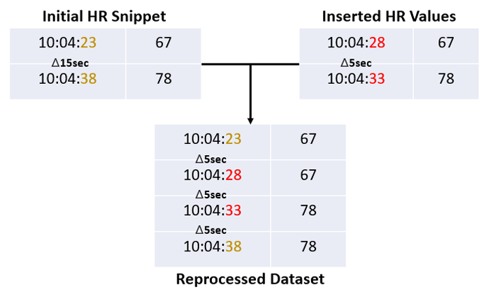
Prior Interpolation
This visualization demonstrates the interpolation method applied to heart rate (HR) data in previous work. In the Initial HR Snippet, gaps of 15 seconds between timestamps are observed, making the data irregular and unsuitable for detailed analysis. The Inserted HR Values section shows how these gaps are addressed by copying existing HR values to fill the missing timestamps at 5-second intervals. The Reprocessed Dataset highlights the final result, where data is evenly spaced in 5-second increments. While this approach ensures temporal consistency, it lacks sophistication as it simply replicates values without considering the natural trends or variability in heart rate. This could potentially introduce inaccuracies in downstream analysis.
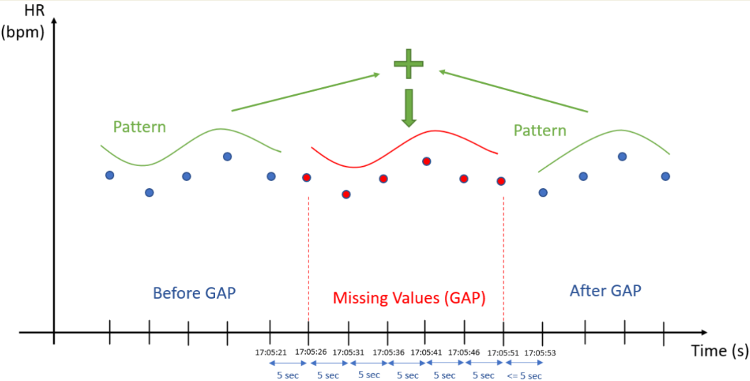
Heart Rate Data Interpolation
This visualization explains the process of handling missing heart rate (HR) data using interpolation. It shows a timeline where HR data points (measured in beats per minute) are plotted before, during, and after a gap caused by missing values. • Before and After GAP: Blue dots represent recorded HR values following a consistent pattern over time. • Missing Values (GAP): Red indicates the absence of HR data, disrupting the continuity of the pattern. • Interpolation: A green line connects the data before and after the gap, reconstructing the missing values based on the observed trend. This method estimates the missing HR values by maintaining the natural pattern in the data. This approach ensures smooth transitions between known data points, preserving the integrity of the dataset and enabling more accurate analysis of HR trends over time.
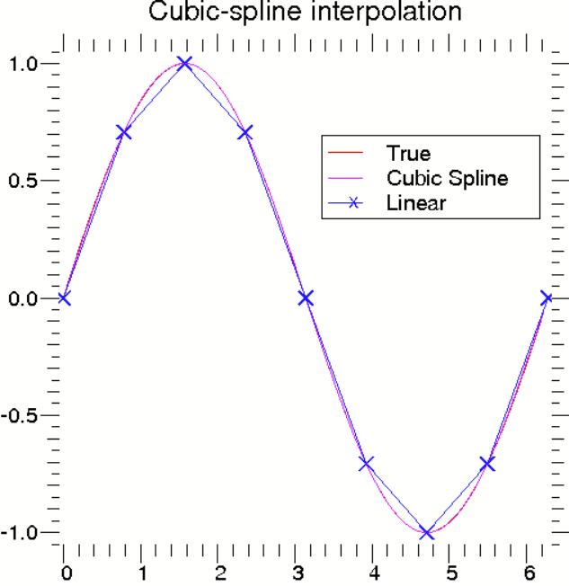
Comparison of Interpolation Techniques
This chart illustrates the differences between cubic-spline interpolation and linear interpolation in approximating missing data points, using a true function (red line) as a reference. • True Line (Red): Represents the original, smooth curve of the function. • Cubic Spline (Magenta Line): Provides a smooth and continuous curve through the data points, closely following the true function. It adjusts the slope at each interval to create a natural and accurate fit, especially effective for capturing nonlinear trends. • Linear Interpolation (Blue Line with Crosses): Connects the data points with straight lines. While simpler, it fails to capture the curvature of the true function, resulting in abrupt transitions and less accurate estimations. The chart demonstrates that cubic-spline interpolation offers a more precise and visually consistent representation of missing values in datasets where underlying patterns are nonlinear, making it preferable for applications requiring smooth and realistic reconstructions.